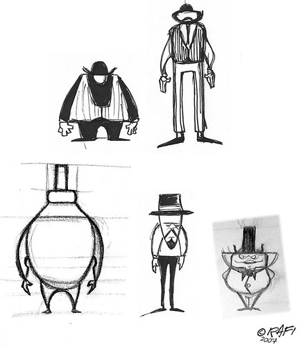
(1) shape variety
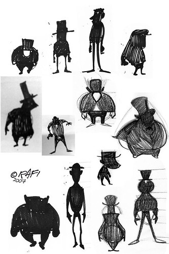
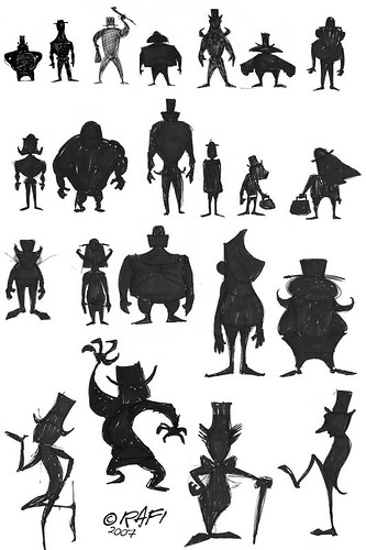
(2) clear silhouettes

The drawings above are doodles I've done at the very start of a project. Details are not my concern at this stage, I'm purely focussed on combining simple and contrasting shapes in an attractive way to create appeal and maintain balance in design.
This process keeps me loose and fresh at the ideas stage. I churn out literally hundreds of these in a morning and eventually, gain an understanding of the particular challenges presented by the character design job at hand.
After spending some time working this way (anything from half a day to 2-3 days , depending on the timings of the job), patterns of ideas emerge and I begin to form a preference for a particular route. So I explore it further via silhouettes:

Silhouettes are the perfect way to test your design. If the silhouette isn't clear, if you can't tell what or rather, who that silhouette is, any design you develop from that, will be just as vague and unsuccessful.
Just like the earlier "shape combos" stage, drawing silhouettes should be super-quick too. Literally 30 seconds or so MAX each. It's all about clarity of the idea. My mentor Stephen Silver would frequently remind me about working from the general to the particular - meaning, get the main shapes working really well. The overall larger structures should make sense and form a strong, clear balanced design, before details are even approached.

Hopefully these silhouettes are self-explanatory. I think you can see which ones read clearer than others, how some imply personality and others define character while remaining as basic as possible.
If this is a new concept for you, I highly recommend checking out on Stephen's Course at Schoolism.com.
Next I'll talk about how I develop a character from the silhouette stage.

No comments:
Post a Comment