I'm art directing an animated tv show right now, having just completed designing colour scripts and backgrounds for the pilot I've now moved on to creating colour palettes for key props. I can't divulge exactly what those props are but I can give you a peak at how some of their colour schemes are shaping up:
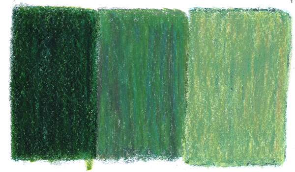
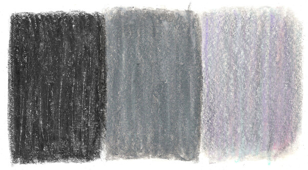
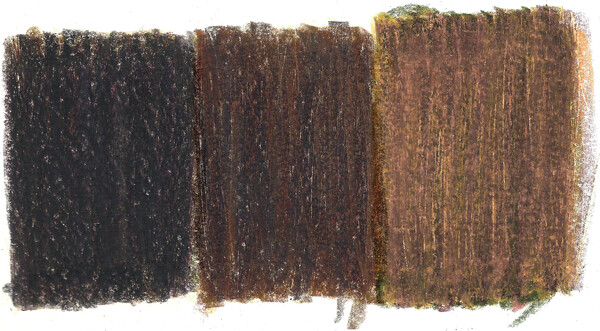
It's worth pointing out that as these are for background objects and props, the palettes are by design muted and subdued - creating a relatively neutral base for the characters and foreground elements that are much more saturated (I'll share some of those in due time).

No comments:
Post a Comment