I thought Amy would be a good person to start with because she has so many unique qualities to her look but as I found out, despite those iconic visual traits of her's, drawing a half-decent caricature is still hard work for me!
I started with this quick sketch:
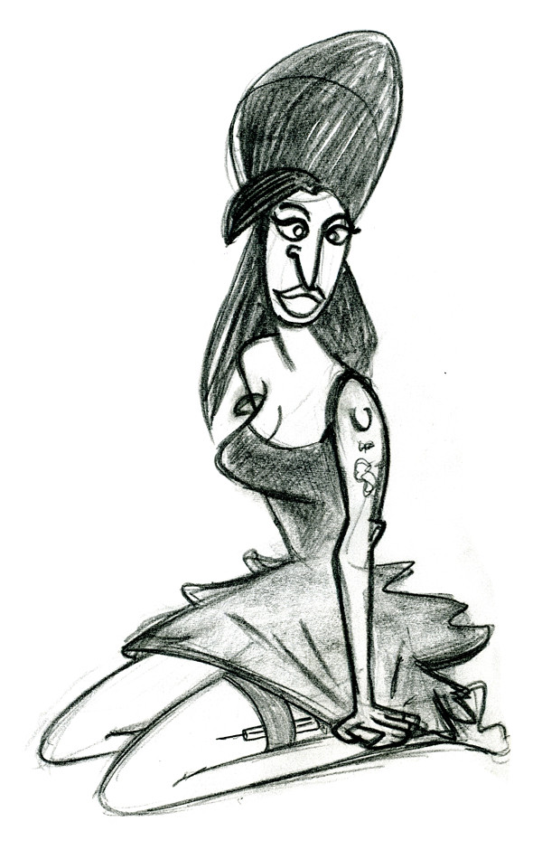
Of course her fantastic hairdo is a big help in cheating that likeness. I've simplified the shape of her head and facial features, making her pretty generic. It's hard to say whether I've over-simplified things - I feel any 'likeness' to Amy in this drawing is down to the tattoos, hair and needle. Not sure if that's cheating or not.
On the subject of the needle, when I look at the work of my favourite caricaturists, there's always much more to them than just a likeness. There's also the artist's perspective or a comment made with it. So in the case of this drawing, I was trying to incorporate the needle from a sympathetic point of view and pose her in a way that represented the fragility of her situation. Dunno how well that comes across.
This next sketch is those same intentions x 10
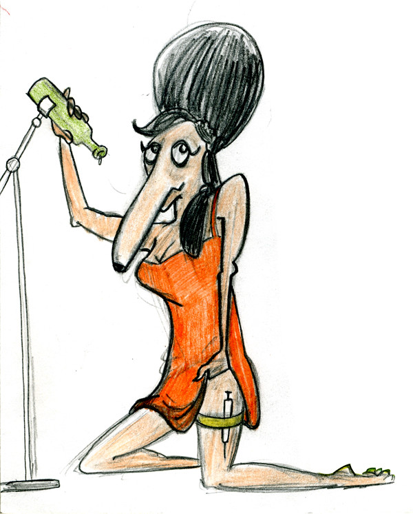
hmmm, perhaps too much of a victim? Besides, throwing in all those props (needle, distorted nose, mic stand/bottle), I felt I ended up with an image containing too many elements for the viewer to decode. There's no solid, clear idea being put across.
So I went the opposite way with the next drawing, and just used one of those props:
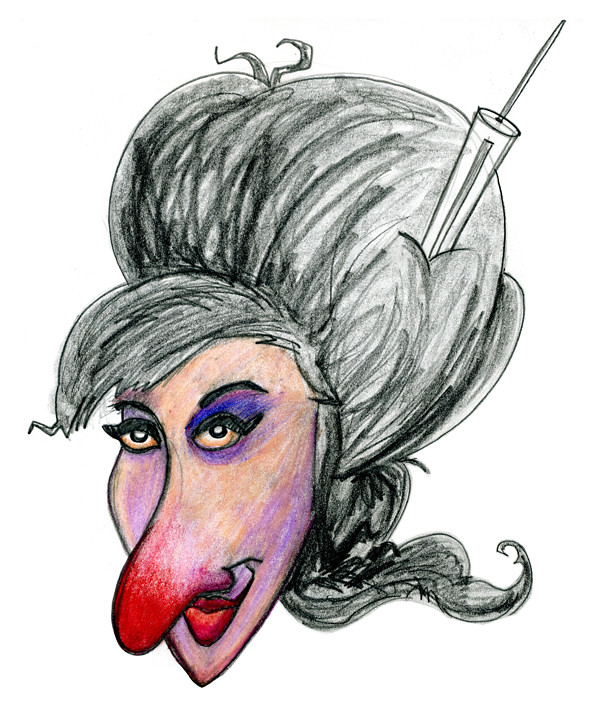
Certainly clearer. Simple. Less is more type stuff.
I couldn't resist this quick doodle next:
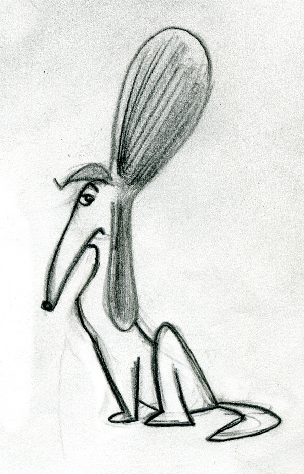
Not much of a likeness, but I do think it's got character. Or it is a character.
So, looking back at the one I posted last week:
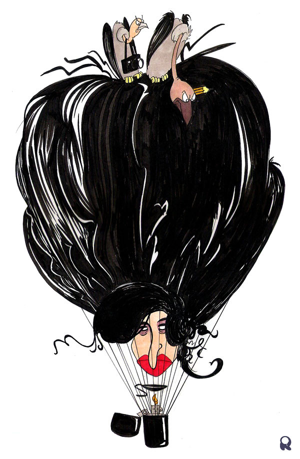
Depicting the press as buzzards was my attempt at building on that sympathetic angle I had at the start. Viewing Amy Winehouse as a victim as much as anything else. I think the balloon idea works well with the buzzards - the notion of her drifting off, getting high etc. has potential. But the lighter and spoon - although in keeping with all the rest, is probably a bit too much for the viewer to decode.
I'll find a way to arrive at an image that reads immediately, with a strong, clear idea and a good likeness to boot.

No comments:
Post a Comment