50 x 40
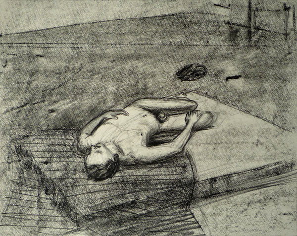
Conté stick on watercolour paper
Right from the start I found the perspective in this drawing super challenging. Dealing with the dramatic shift in scale across and down the figure while having an almost aerial viewpoint of the upper body was tricky work. For example, the radical difference in size between the arms seem at odds with the even flatness of his chest. But that's how it looked. Although his thighs travel almost parallel to our picture plane, the lower half of his body recedes pretty rapidly - notice how little of his left leg/foot is visible past the knee which makes his right arm feel disproportionately long. That arm is the only fully visible limb which adds to the confusion.
I realised pretty quickly that drawing the figure alone wasn't working so I started over and included the space in which our model was posing, in the hope that it would help me convey a sense of that perspective better.
Ultimately, as is often the case, I had to work hard to see everything as shapes instead of falling into the habit of labeling things as I went along - like thinking to myself "the hand is pressing against the thigh which has the other thigh resting half on top" and so on. Referring to individual parts like this stops me from thinking of the picture as a whole and always results in a really disconnected drawing.
So with this drawing I tried to continuously observe the whole scene and build everything up together by constantly relating back and forth as I drew. Looking solely at the values i.e. the relative darkness or lightness of all the elements in the drawing, the surrounding space also creates a tonal context for the figure.
All of this leads me to think that any drawing that holds together well (I'm not saying this one does) has to be sensitive to the relationship between each of its visual components. Surely developing the picture as a whole must help get to that.

No comments:
Post a Comment