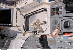
This photo from nasa's image of the day archives struck me as having excellent colour harmony. I'm sure that wasn't the photographer's primary concern at the time, yet all the hues work beautfilly together - nothing clashes, everything is complimentary, the most vibrant and opposing colours are separated by neutral midtones and visually rich while remaining well within a very limited colour palette.
In fact, 90% of it is mostly midtone neutrals so it's also a great reference for the study of tonal value proportions in picture making - i.e. the balance of greys/whites/blacks in the overall composition.

Sunday, 23 March 2008
Great colour in NASA photo
Subscribe to:
Post Comments (Atom)
No comments:
Post a Comment